Сертификация Microsoft
Экзамен DA-100: Analyzing Data with Microsoft Power BI
Аналитики данных (Data Analysts ) позволяют компаниям увеличить до максимума ценность своих данных с помощью Microsoft Power BI. В качестве экспертов в данной области, аналитики данных отвечают за:
-
разработку и построение масштабируемых моделей данных,
-
очистку и преобразование данных,
-
а также за предоставление расширенных аналитических возможностей, которые обеспечивают значимую бизнес-ценность благодаря простой для понимания визуализации данных.
Аналитики данных также сотрудничают с ключевыми специалистами компании по всем вертикалям, чтобы предоставить им релевантную информацию, основанную на реальных требованиях бизнеса.
Аналитик данных должен иметь фундаментальное представление о хранилищах данных и работе с ними как локально, так и в облаке.
Некоторые требования к специалисту Microsoft Certified: Data Analyst Associate – Skills Measured (pdf 210Kb)
Что такое DA-100?
В начале 2020 года (или, может быть, даже в конце предыдущего), компания Microsoft объявила, что будет изменена стратегия сертификации и прохождения экзаменов. Вместо того, чтобы получать сертификат по использованию определенных инструментов (например, SQL Server, Power BI и т.д.), сертификация теперь основывается на определенных технологиях – ROLES (например, Data Analyst, Data Engineer, Data Scientist, Developer и т.д.).
Это означает, что старые сертификации и экзамены отменены, а DA-100 является «законным» преемником существующего ранее экзамена 70-778 Analyzing and Visualizing Data с Power BI. Если вкратце взглянуть на программу обоих экзаменов, то можно сказать, что они пересекаются примерно на 80%, а это значит, что если вы уже подготовились к 70-778, то, скорее всего , сможете легко перейти к сдаче DA-100.
Но, поскольку Power BI очень быстро меняется, в DA-100 включено много новых причудливых функций, особенно связанных с ИИ. Однако, не волнуйтесь раньше времени, если вы еще не знакомы с этими темами — они составляют лишь малую часть экзамена.
Все что вам нужно знать о Microsoft DA-100 Exam:
Сертификат о сдаче экзамена DA-100: Analyzing Data with Microsoft Power BI — это прекрасное подтверждение вашей квалификации как аналитика данных. Этот Сертификат гарантирует, что вы сможете грамотно подготовить модель данных, визуализировать и проанализировать, развернуть данные и наилучшим образом продемонстрировать результаты.
Сдавший экзамен получает сертификат Microsoft Certified: Data Analyst Associate Certification. Сертификация подтверждает квалификацию в области Анализа данных (Data Analysts skills). Что, в свою очередь, поможет Вам, используя инструментарий Microsoft Power BI, улучшить качество данных Вашей организации и повысить эффективность ее работы.
С правилами проведения экзамена Вы можете ознакомиться здесь.
Подготовка к экзамену
Наилучшей подготовкой к экзамену, в любом случае, послужит Ваш практический опыт работы с Power BI. Но, есть вероятность, что Ваши навыки, основанные на каждодневной работе не покрывают всех тем экзамена. В этом случае Вам потребуются альтернативные пути для подготовки. Отличный вариант – воспользоваться материалами, подготовленными компанией Microsoft, которая опубликовала ссылки на материалы для подготовки к каждому разделу экзамена: learning paths for every single section
Это фантастическая новость, здесь можно найти детальные материалы по каждой теме. Это замечательная опция Microsoft Learn, чтобы улучшить свои знания Power BI, и это может реально помочь Вам в подготовке к экзамену. Поэтому, если вы хотите подготовиться бесплатно, просто зайдите в Microsoft Learn и начните просматривать все темы.
Еще один замечательный ресурс — онлайн-курс Паркера Стивенса из BI Elite: online course by Parker Stevens from BI Elite. Этот курс не бесплатный, но он стоит тех знаний, которые вы получите. В нем детально рассматриваются все пункты, перечисленные в подготовительном листе. По свидетельству многих специалистов, Паркер Стивенс является настоящим экспертом в Power BI, и этот курс также стоит рассмотреть при подготовке к экзамену.
Еще один платный ресурс, который поможет Вам получить уверенность в своих силах перед в сдачей экзамена, это пройти предварительные тесты, например здесь: Exams4sure DA-100
Если же Вы планируете пойти платную подготовку с помощью тренера Вы можете выбрать сертифицированные учебные центры Microsoft, которые предлагают подобные услуги.
Практические советы по подготовке к экзамену DA-100
-
Получите максимальную информацию о экзамене: до того, как вы начнете его сдавать или даже до того, как начнете к нему готовиться. Узнайте, что вас ждет. Получите информацию на официальном сайте экзамена. Или зайдите в блог, посвященный экзамену.
-
Получите информацию о сертификации: помимо получения необходимых знаний и навыков, всегда есть определенные предварительные условия для получения сертификата. Информация об условиях сертификации необходима так же как и знания для сдачи экзамена.
-
Готовьтесь к экзамену с помощюь проверенных методов: вы не единственный на этом пути. И вы точно не являетесь первым из тех, кто подал заявку на экзамен. Интернет наводнен ресурсами, советами и хитростями для сдачи экзамена. Изучите опыт ваших коллег, присоединяйтесь к сообществам, форумам и следите за блогами, посвященными вашему экзаменому. Следуйте тем методам, которые уже проверены до вас и применяйте их с пользой для себя.
-
Ищите наилучшие варианты обучения: как уже упоминалось ранее, интернет наполнен различными ресурсами, посвященными экзамену DA-100. Внимательно изучите различные варианты и выберите лучшее, из того, что предлагается. Например: DA-100 exam dumps questions. Этот ресурс, несомненно, является одним из лучших вариантов, поскольку он доступен по цене, содержит новейшие версии вопросов, и полностью соответствует формату экзамена.
-
Приложите все свои усилия для обучения: Вы уже получили информацию о том какие возможности есть у вас для подготовки. Теперь все, что осталось, — это учиться изо всех сил. Для этого мы предлагаем вам составить правильный график обучения и строго следовать ему. И главное — верьте в себя и в свои знания. Это поможет вам побороть волнение и сдать экзамен легко и быстро
Экзамен
Сам экзамен длится 180 минут, и этого более чем достаточно, чтобы все успеть.
Итак, первый важный совет:
Не паникуйте, не торопитесь — времени действительно достаточно, чтобы тщательно обдумать вопросы, ответы и перепроверить все позже.
Экзамен состоит из комбинации вопросов с несколькими вариантами ответов и практических задач, связанных с конкретными кейсами. Вот наш следующий совет:
В начале сосредоточьтесь на решении задач, так как среди них есть некоторые специфические запросы, которые необходимо тщательно изучить.
Ниже перечислены темы экзаменационных вопросов, для каждой темы указана вероятность ее появления (в процентах) в процессе экзамена:
-
Подготовка данных (20-25%)
-
Моделирование данных (25-30%)
-
Визуализация данных (20-25%)
-
Анализ данных (10-15%)
-
Развертывание и поддержка поставляемых продуктов (10-15%)
Некоторые требования к специалисту Microsoft Certified: Data Analyst Associate – Skills Measured (pdf 210Kb)
Что же касается тем, посвященных DAX и M, их в структуре экзамена не так много. Только те действительно основные вещи, которые по умолчанию в любом случае должны входить в базовый набор навыков любого начинающего аналитика данных (и PowerBI’щика).
Заключение
Если вы успешно сдали экзамен (и мы верим, что все, кто читает эту статью, сделают это), вы получите сертификат MCSA (Microsoft Certified: Data Analyst Associate), который действителен в течение 2 лет с момента сдачи экзамена.
Вам может быть интересно
Материалы для скачивания:
- Microsoft Certified: Data Analyst Associate – Skills
Measured
Следующий материал »
Сертификация Microsoft Power Bi — это важный сертификат, который должен получить каждый технологический гигант в 2022 году. Power BI — это набор программных сервисов, приложений и соединителей, которые работают вместе для преобразования разрозненных источников данных в логические, визуально захватывающие и интерактивные идеи.
Несмотря на то, что крупные обновления платформы Power BI происходят нечасто, Microsoft продолжает регулярно предоставлять новые аналитические функции и возможности.
В этой статье дается подробное руководство о том, как получить сертификат Microsoft Power Bi в 2022 году.
Что такое Power BI?
Ваши данные могут быть электронной таблицей Excel или набором гибридных облачных и локальных хранилищ данных в Power Bi.
Power BI позволяет легко подключаться к вашим источникам данных, визуализировать и раскрывать то, что важно, и делиться своими выводами с кем угодно.
Компоненты Power BI:
В соответствии с Microsoft, Power BI состоит из нескольких элементов, которые работают вместе, начиная с этих трех основных элементов:
- Настольное приложение Windows под названием Power BI Desktop.
- Онлайн SaaS (Программное обеспечение как услуга) называется службой Power BI.
- Мобильные приложения Power BI для устройств Windows, iOS и Android.
Как получить доступ к сертификации Power BI:
Эти три компонента — Power BI Desktop, служба и мобильные приложения — созданы для того, чтобы помочь вам создавать, распространять и использовать бизнес-аналитику наиболее эффективным способом для вас и вашей роли.
Получение в нем сертификата — отличный способ начать работу с аналитикой данных. Согласно обзору решения, «Основы визуализации данных с Power BI» — лучшая сертификация Power BI.
Учащиеся, завершившие этот курс, узнают, что изучение, обработка и отображение данных в каждой программе требует использования жизненного цикла данных.
Этот курс сертификации Power BI для самостоятельного обучения включает два курса повышения квалификации. Более того, на это уйдет не менее двух месяцев.
Прочитайте больше: Сертификат против степени — что лучше?
Стоит ли сертификация Microsoft Power BI?
Да, получение сертификата Power Bi того стоит. Сертификация Microsoft Power Bi подтверждает знания, повышает профессиональный авторитет и расширяет возможности трудоустройства.
Power Bi является лидером рынка с точки зрения возможностей исполнения. Это делает сертификацию Microsoft Power Bi полезной, поскольку она способствует использованию аналитического мышления при разработке решений.
Как получить сертификат Microsoft Power Bi в 2022 году
Получите бесплатную версию Microsoft Сертификация Power Bi курсы:
Многочисленные онлайн-ресурсы помогут вам подготовиться к этому сертификационному экзамену. Кроме того, это слишком дорого — 165 долларов за сеанс.
Таким образом, прежде чем записываться на экзамен, вы должны пройти все доступные пробные экзамены. Большинство онлайн-курсов по Power BI предлагаются бесплатно, но не все.
Тем не менее очень важно выбрать курс, который проведет вас через процесс загрузки и установки рабочего стола Microsoft Power BI, а затем создания отчетов и панелей мониторинга.
Запланировать экзамен:
Когда будете готовы, перейдите на веб-сайт Microsoft Power BI и назначить экзамен.
По сути, вы должны заплатить 165 долларов за экзамен. Так что убедитесь, что вы исследовали все. Срок действия экзамена истекает 31 марта 2022 года. Более того, 28 февраля 2022 года будет выпущен новый тест (Экзамен Pl-300: Microsoft Power BI Data Analyst).
Сдать экзамены
Для сдачи сертификационного экзамена Microsoft Power Bi требуется балл 700+.
Вы должны сдать экзамен DA-100, чтобы получить сертификат Microsoft Power Bi в 2022 году. Экзамен DA-100 измеряет вашу способность выполнять следующие технические задачи:
- Подготовьте данные (20-25%)
- Смоделируйте данные (25-30%)
- Визуализируйте данные (20-25%)
- Анализ данных (10-15%)
- Развертывание и поддержка результатов (10-15%)
Вы можете получить сертификат Microsoft Power BI после сдачи экзамена. Это важный шаг к сертификации Microsoft.
Чтобы пройти, вы должны набрать 700 баллов или выше. Перед сдачей этого экзамена вы должны иметь базовые знания о репозиториях данных, обработке данных в локальной среде и в облаке.
Экзамен предназначен для подтверждения того, что вы способны создавать масштабируемые модели данных, а также очищать данные и манипулировать ими.
Вы также должны быть в состоянии предоставить расширенные аналитические возможности, которые создают значительную ценность для бизнеса за счет простой для понимания визуализации данных, чтобы стать специалистом по Power Bi.
Прочитайте больше: 7+ лучших школ информатики в Миссури (экспертные исследования)
Вывод:
Учетные данные Microsoft могут помочь вам быстрее и проще получить работу. A+ теперь является самой высокооплачиваемой сертификацией Microsoft. По оценкам на 2020 год, средняя заработная плата составляет 125 993 доллара.
Потрясающий; Я надеюсь, что эта статья ответила на ваш вопрос.
This PL-300(earlier named as DA-100) Certification Exam: Microsoft Power BI Data Analyst certification is for data analysts. This certificate is crucial for you if you use Power BI to create data visualizations. The DA-100 course teaches you to design scalable data models, clean and transform data and present analytic insights.
This set of 25 DA 100 exam questions will cover the important skills measured in the DA-100 Exam such as:
- Prepare the data
- Create a model
- Create Visualization
- Analyze and prepare insights
- Deploy and maintain deliverables
These DA 100 exam questions will give you a very good idea of how the actual exam would look like; you can practice more with our DA-100 practice exam.
Latest Update 2022:
The Exam DA-100 Analyzing Data with Microsoft Power BI has been expired on March 31, 2022 and the name changed to PL-300 Microsoft Power BI Data Analyst.

Model the data
Q 1. You are interested in creating a measure that will always calculate the total sales for 2020, irrespective of the year selected in any other visual in Power BI. Which of the following is the right way to create such a measure?
A. Total Sales for 2020= CALCULATE(SUM(‘Sales OrderDetails'[Total Price]), YEAR(‘Sales OrderDetails'[orderdate]) = 2020)
B. Total Sales for 2020= SUM(CALCULATE(‘Sales OrderDetails'[Total Price]), YEAR(‘Sales OrderDetails'[orderdate]) = 2020)
C. Total Sales for 2020= TOTAL(SUM(‘Sales OrderDetails'[Total Price]), YEAR(‘Sales OrderDetails'[orderdate]) = 2020)
D. It is not possible to create such a measure.
Correct Answer: A
The CALCULATE function in DAX helps in creating a measure that will override the specific portions of the context that are being utilized to express the correct result. The syntax to use the calculate function is:
CALCULATE(<expression>[, <filter1> [, <filter2> [, …]]])
Where expression represents the expression that is to be evaluated and Filter1, Filter2 are optional and represent the table or Boolean expressions that define filters, or filter modifier functions.
As an example, the following measure can be created for the SALES table that will calculate the revenue for the only products that have a blue color.
Blue Revenue =
CALCULATE(
SUM(Sales[Sales Amount]),
‘Product'[Color] = “Blue”
)
- Option A is correct. CALCULATE function in DAX is used to create a measure that will override the specific portions of the context that are being utilized to express the correct result. As we are interested in calculating the total sales for 2020, we will use the SUM function inside the CALCULATE.
- Option B is incorrect. CALCULATE is the DAX function and SUM should be used inside the CALCULATE. The given expression is not correct syntactically.
- Option C is incorrect. Total is not the function to calculate the total sales. Instead, CALCULATE is the right function to calculate the total sales.
- Option D is incorrect. The expression given in option A is a way to create the required measure.
Q 2. Consider the below-given sample data:
| Date | Day | Month |
| 2021-02-01 | 1 | 2 |
| 2021-02-02 | 2 | 2 |
| 2021-02-03 | 3 | 2 |
| 2021-02-04 | 4 | 2 |
You need to create a calculated column to show the date in a format like this February 01, 2021. Which of the following DAX expression would you use?
A. FORMAT([Date],”M”)|| FORMAT([Date],”D”)|| FORMAT([Date],”Y”)
B. FORMAT([Date],”MMMM DD, YYYY”)
C. FORMAT([Date],”MMM”)|| FORMAT([Date],”DD”)|| FORMAT([Date],”YYYY”)
D. FORMAT(‘Date_Table’ [Date],”MMM”)|| FORMAT(‘Date_Table’ [Date],”DD”)|| FORMAT(‘Date_Table’ [Date],”YYYY”)
Correct Answer: B
“MMMM” is a user-defined format for date/time that displays the full month name as the month. FORMAT([Date],”MMMM DD, YYYY”) is the right DAX expression.
- Option A is incorrect. The given DAX expression is not correct to show the date in the required format.
- Option B is correct. FORMAT([Date],” MMMM DD, YYYY”) is the right DAX expression to show the date in the required format.
- Option C is incorrect. The given DAX expression is not correct to show the date in the required format.
- Option D is incorrect. The given DAX expression is not correct to show the date in the required format.
Q 3. The data model has an impact on the time consumed in the refreshing of a model but once the model is loaded in the memory, it has no impact on the performance of the reports. Select whether the statement is True/False.
A. True
B. False
Correct Answer: B
In the case of a large data model, the measures need to iterate over more data and therefore the evaluation is likely to consume more time that will certainly affect the performance of the reports. Therefore, reducing the size of the data model by removing the unnecessary rows or columns will help in improving the performance of the reports.
Q 4. What will be the result of the following DAX formula if the year 2020 is chosen on a slicer of a report?
2019 Salary_Cost = CALCULATE([Total Salary_cost], Filter (Date, Date[Year]=2019))
A. Salary_cost for the Year 2020 as Slicer Selection overrides DAX Filter.
B. Salary_cost for the Year 2019 as DAX Filter overrides Slicer Selection.
C. Blank. It will return no records.
D. It will return Salary_cost records for the year 2019 as well as 2020.
Correct Answer: C
First, the given DAX expression was supposed to have a SUM function to calculate the total sales. Moreover, in the given scenario, the Slicer selection for the year 2020 will also be applied along with the DAX expression. It is not possible for any record to have both years i.e year 2019 and year 2020 at the same time. Therefore, the given DAX expression in the current scenario will return nothing.
- Option A is incorrect. Salary_cost for the Year 2020 as Slicer Selection overrides DAX Filter is not the correct answer.
- Option B is incorrect. Salary_cost for the Year 2019 as DAX Filter overrides Slicer Selection is not the correct answer.
- Option C is correct. The DAX expression in the current scenario will return blank as no record can have both years i.e year 2019 and year 2020 at the same time.
- Option D is incorrect. The given DAX expression in the current scenario will return a blank.
Q 5. Which of the following is the right DAX function to modify a single directional relationship to a bi-directional relationship on the fly (within the measure)?
A. TREATAS
B. USERELATIONSHIP
C. CROSSFILTER
D. RELATEDTABLE
E. RELATED
Correct Answer: C
CROSSFILTER is a DAX function that takes the two columns and set the cross filter relationship between these columns.
- Option A is incorrect. TREATAS allows you to create virtual relationships. This function is best to use when there exists no relationship between the tables.
- Option B is incorrect. USERELATIONSHIP function is used to activate the inactive relationships.
- Option C is correct. CROSSFILTER function allows modifying a single directional relationship to a bi-directional relationship.
- Option D is incorrect. RELATEDTETABLE is a DAX function that modifies the context in which the data is filtered, and calculates the given expression in the new specified context.
- Option E is incorrect. RELATED function returns a related value from some other table. To use the Related function, there is a need for a relationship between the current table and the table having related data.
Q 6. What is the use of Row Level Security (RLS) in Power BI?
A. Assigning the security permissions for the underlying Power BI Azure SQL Database
B. Adding the ability to link Power BI Log-in to organizational Active Directory or Window Login through Single Sign On (SSO)
C. Restricting data access for the given users ( By assigning users to roles)
D. Restrictions to specific measures within Power BI reports to some specific users
E. All the above
Correct Answer: C
The use of Row Level Security in Power BI is to restrict or limit the data access for the specified users. The Filters restrict the data access at row-level and filters can be defined within roles. In Power BI service, the members can access the datasets in the workspace. Row Level security does not put restrictions on this data access.
- Option A is incorrect. RLS does not assign the security permissions for the underlying Power BI Azure SQL Database.
- Option B is incorrect. RLS does not add the ability to link Power BI Log-in to organizational Active Directory or Window Login through Single Sign On (SSO) is not the use of RLS in Power BI.
- Option C is correct. The use of RLS is to restrict data access for the given users ( By assigning users to roles).
- Option D is incorrect. RLS does not make restrictions to specific measures within Power BI reports to some specific users.
- Option E is incorrect. The given option is not the right choice.
Q 7. Consider that you want to split your query into two parts. Which of the following options would you use in Power BI?
A. Format Query
B. Split Query
C. Extract previous
D. Mark Query
Correct Answer: C
Extract Previous is the option that helps in splitting the query into parts. If you want to split a query, right-click an applied step (as per desire or requirements) to the query and choose the exact previous option. It will split the query into 2 parts by making a new query consisting of all the steps before the selected step.
- Option A is incorrect. It is the Extract Previous option, not Format Query, that is used to split the query in Power BI.
- Option B is incorrect. It is the Extract Previous option, not Split Query, that is used to split the query in Power BI.
- Option C is correct. Extract Previous is the option that helps in splitting the query into parts in Power BI.
- Option D is incorrect. It is the Extract Previous option, not Mark Query, that is used to split the query in Power BI.
Q 8. Consider the statement below.
Row Level Security can’t be applied in Power BI Desktop while connecting via a Live connection to Analysis Services, these need to be set within the AS model.
A. True
B. False
Correct Answer: B
You can configure Row-Level Security for the data models imported in Power BI through Power BI Desktop. It is also possible to configure Row Level Security (RLS) on the datasets that use DirectQuery, such as SQL Server. But for Analysis Services or Azure Analysis Services live connections, Row-level security is configured within the model, not Power BI Desktop. The AS models hold RLS roles already that can be used by Power BI via a Live connection.
Visualize the data
Q 9. Your team manager has given you a task to create a Power BI dashboard consisting of visualizations for sales data. You have been asked to add some sample questions that can be asked by the users while using the Q&A option. To enable the sample questions, what will you modify in the settings of Power BI?
A. Dashboards
B. Reports
C. Datasets
D. Workbooks
Correct Answer: C
To enable the sample questions for the users, it is the datasets that should be modified in Power BI settings.
- Option A is incorrect. It is the datasets, not the dashboards, that should be modified in Power BI settings.
- Option B is incorrect. It is the datasets, not the Reports, that should be modified in Power BI settings.
- Option C is correct. Datasets should be modified in Power BI settings to enable the sample questions for the users in Q&A analysis.
- Option D is incorrect. It is the datasets, not the workbooks, that should be modified in Power BI settings.
Q 10. You have created a dashboard with the help of Microsoft Power BI Service. The dashboard has a card visual that displays the total sales from the last year.
You provide users access to the dashboard through the Viewer role on the workspace.
A user is interested in receiving daily notifications for the number displayed on the card visual. Which of the following is the right choice to automate the notifications?
A. Creating a data alert.
B. Sharing the dashboard to the user.
C. Creating a subscription.
D. Tagging the user in a comment.
Correct Answer: C
You can subscribe your mates and yourself to the dashboards, report pages, and paginated reports that are significant to you. Power BI e-mail subscription allows you to choose how frequently you are interested in receiving the emails: monthly, weekly, daily, hourly, or once a day after the initial data refresh and even the time you are interested in receiving the email if you select monthly, weekly, daily or hourly.
- Option A is incorrect. Creating a data alert is not the right option. Data alerts are created to notify you when the data in the dashboard is changed beyond the limits set by you.
- Option B is incorrect. Sharing the dashboard to the user is not the right option to automate the notifications.
- Option C is correct. Creating a subscription will help in automating the notification on daily basis for the number displayed on the card visual.
- Option D is incorrect. Tagging the user in a comment is not the right option.
Q 11. You are creating a complex report having a lot of visuals in Power BI. You want to ensure that the users read it in a logical way when they use the keyboard. From the following list, select the right option which you need to work on.
A. Page Order
B. Tab Order
C. Layer Order
D. Field Hierarchy
E. Bookmark Order
Correct Answer: B
Tab order defines the order in which a user interacts with the things on a page through the keyboard. If you want to change the default order, open the selection pane from the view tab and choose the Tab Order.
- Option A is incorrect. It is the Tab order, not Page order, which you need to work on to ensure that the users read in a logical way.
- Option B is correct. Tab order defines the order in which a user interacts with the things on a page through the keyboard. Therefore, to make the users read in a logical way, change the default order from the Tab order.
- Option C is incorrect. It is the Tab order, not Layer order, which you need to work on to ensure that the users read in a logical way.
- Option D is incorrect. It is the Tab order, not Field Hierarchy, which you need to work on to ensure that the users read in a logical way.
- Option E is incorrect. It is the Tab order, not Bookmark Order, which you need to work on to ensure that the users read in a logical way.
Q 12. You have a Consumer Sales Revenue monthly report. You analyze and notice that the attrition Rate metric is sharply increased.
You are interested in understanding the variables that might affect this result.
Which of the following visuals can you use to understand and explore the potential causes in Power BI Desktop?
A. Decomposition tree visuals
B. Funnel Visual
C. Key Influencer Visual
D. Combo visual
E. Waterfall Visual
Correct Answers: A and C
Decomposition Tree is an Artificial Intelligence visual that is ideal for ad hoc exploration and conducting root cause analysis. It helps in automatically analyzing the chosen dimensions to check where the measure is having the lowest or highest value. key influencer visual is another visual that is a good choice to know the factors that influence a key metric.
- Option A is correct. Decomposition tree visuals can be used to understand and explore the potential causes of sharp increment in attrition Rate metric in the given scenario.
- Option B is incorrect. A funnel chart displays a linear process consisting of sequential connected stages and the items flow sequentially from one stage to the next stage. It’s not the right choice for the desired purpose.
- Option C is correct. Key influencer visual is another visual that is an excellent choice to know the factors that influence a key metric and therefore can be used to understand and explore the potential causes of sharp increment in attrition Rate metric in the given scenario.
- Option D is incorrect. Combo visual is the ideal choice for comparing multiple measures with different value ranges, not for the desired purpose.
- Option E is incorrect. Waterfall visual is the ideal choice to show the beginning and ending headcount for the organization in a year, not for the desired purpose.
Q 13. You have several dashboards. You want to ensure that when the users browse the available dashboards from powerbi.com, they should be able to view which dashboards have personally identifiable information (PII). The solution needs to minimize the configuration efforts and effect on the dashboard design.
Which of the following would you use?
A. Tiles
B. Comment
C. Active Directory groups
D. Data Classifications
E. Feedback
Correct Answer: D
With the help of dashboard data classification, you can raise awareness with the viewers of the dashboards about the level of security that should be utilized. You can tag your dashboards with classifications mentioned by the IT department of your company, so everyone seeing the content will have the same level of information and understanding around the sensitivity of the data.
Therefore, by using data classification, you can make sure that when the users browse the available dashboards from powerbi.com, they can view which dashboards have personally identifiable information (PII).
- Option A is incorrect. Using data classification, not tiles, is the right solution.
- Option B is incorrect. With the help of the Comment feature in the Power BI Dashboard, it is possible to get feedback from the users and make those features visible to other users as well. Using data classification is the right solution.
- Option C is incorrect. Using data classification, not Active Directory Group , is the right solution.
- Option D is correct. Using data classification, you can make sure that when the users browse the available dashboards from powerbi.com, they can view which dashboards have personally identifiable information (PII).
- Option E is incorrect. Using data classification, not Feedback is the right solution.
Analyze the data
Q 14. Which of the following Azure Cognitive Services models can be called through the AI insights feature in Power BI Desktop? (Select Multiple Options)
A. Sentiment Analysis
B. Key Phrase Extraction
C. K-mean Clustering
D. Language Detection
E. Binary Classification
F. All of the above
Correct Answers: A, B, and D
AI Insights option in Power BI Desktop includes Azure Cognitive Services models -Sentiment Analysis, Key Phrase Extraction, and Language Detection. These models help derive the meaning or specific pieces of language from text data. For example, the Sentiment Analysis or Key Phrase Extraction option can be used to know the customer sentiments in the Help tickets and visually demonstrate the results in Power BI.
- Option A is correct as Sentiment analysis is an Azure cognitive services model that can be called through the AI insights feature of Power BI Desktop.
- Option B is correct as Key Phrase Extraction is an Azure cognitive services model that can be called through the AI insights feature of Power BI Desktop.
- Option C is incorrect as the K-mean clustering model is not available through AI insights to feature in Power BI Desktop.
- Option D is correct as Language Detection is an Azure cognitive services model that can be called through the AI insights feature of Power BI Desktop.
- Option E is incorrect as the Binary Classification model is not available through the AI insights to feature in Power BI Desktop.
- Option F is incorrect as K-mean clustering and Binary classification models are not available through the AI Insights feature.
Q 15. Which of the following chart is the great choice to identify or display the outliers?
A. Line Chart
B. Scatter Chart
C. Bar chart
D. Donut chart
Correct Answer: B
Scatter chart is the best choice to identify the outliers in the data. After identification of the outliers, the reasons for their existence can be investigated or explored and corrective action is taken. The following is an example of a “Scatter chart” that shows the number of orders by Orders Shipped by Product Category.
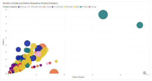
- Option A is incorrect as Line charts are not appropriate to display the outliers. Scatter charts are the better choice.
- Option B is correct as the Scatter chart is a good choice to display the outliers.
- Option C is incorrect as Bar charts are not appropriate to display the outliers. Scatter charts are the better choice.
- Option D is incorrect as the Scatter chart, not Donut charts, are a good choice to display the outliers.
Q 16. You need to create a report that will demonstrate the sales performance of the company. The sales team has requested you to add a single visualization (if possible) that might help them in identifying the factors that drive the sales and affect the success. Which of the following visualization would you use?
A. Key influencers
B. Funnel chart
C. Donut Chart
D. Q&A visualization
Correct Answer: A
key influencers are a specific type of visuals that help in identifying the factors that drive the target matric. It analyzes the given data, ranks the factors that matter, and shows them as key influencers. The two most important scenario where key influencers do great are :
To see the factors that affect the metric being analyzed.
To contrast the relative importance of the identified factors.
- Option A is correct as Key influencers are a good choice to identify what factors drive the sale and affect the success.
- Option B is incorrect. The funnel charts display a linear process that consists of sequential connected stages and the items flow sequentially from one stage to the next stage. They don’t help in identifying the factors that affect a metric.
- Option C is incorrect. Donut charts represent the data by dividing it into slices and are not helpful in identifying the key factors.
- Option D is incorrect. Q&A visualizations allow the users to ask natural language questions and get answers in the form of a visual.
Q 17. There is a dashboard named Salary_Cost having Q&A enabled on it. When a user tries to get the count of Employees, the query gets failed. On the other hand, when the user asks for the count of workers, the query returns the expected result.
You need to ensure that the same result is returned by both queries. Which of the following actions would you perform?
A. Editing synonyms from the Power BI service
B. Editing Relationships from the Power BI Desktop
C. Editing synonyms from the Power BI Desktop
D. Editing tables from the Power Query in Power BI Desktop
Correct Answer: C
When you are interested in improving the Q&A experience, it is always a good practice to add synonyms from the Power BI Desktop Model view.
- Option A is incorrect. Editing synonyms from the Power BI service is not the right choice. Instead, you should edit synonyms from the Power BI Desktop.
- Option B is incorrect. Editing Relationships from the Power BI Desktop is not the right option to ensure that both above said queries return the same result.
- Option C is correct. To ensure that both above said queries return the same result, you should edit synonyms from the Power BI Desktop.
- Option D is incorrect. Editing tables from the Power Query in Power BI Desktop is not the right option to ensure that both above said queries return the same result.
Q 18. Which of the following tasks can’t be performed using the dataset settings option of the Power BI Service?
A. Modify query editor parameter values
B. Check the cardinality for the columns in the dataset
C. Mark the dataset as certified or promoted
D. Change the credentials used for connecting to the underlying data source
E. Define the sensitivity label for the dataset
Correct Answer: B
Using the dataset settings option in Power BI, you are able to modify query editor parameter values, mark the dataset as certified or promoted, change the credentials used for connecting to the underlying data source and define the sensitivity label for the dataset. But it is not possible to view or check the cardinality of the columns using this option.
- Option A is incorrect. It is possible to modify query editor parameter values using the dataset setting option.
- Option B is correct. It is not possible to check the cardinality for the columns in the dataset using the dataset setting option.
- Option C is incorrect. It is possible to mark the dataset as certified or promoted using the dataset setting option.
- Option D is incorrect. It is possible to change the credentials used for connecting to the underlying data source using the dataset setting option.
- Option E is incorrect. It is possible to define the sensitivity label for the dataset using the dataset setting option.
Deploy and maintain deliverables
Q 19. Here is the list of configuration steps (given in improper sequence) for Row-level security (RLS).
- Create a report in Microsoft Power BI Desktop that involves import the data, confirm the data model between both tables, and create the report visuals.
2. Create RLS roles in Power BI Desktop by using DAX.
3. Test the roles in Power BI Desktop.
4. Add members to the role in the Power BI service.
5. Deploy the report to Microsoft Power BI service.
6. Test the roles in the Power BI service.
The correct sequence of steps for RLS configuration is :
A. 1-3-2-4-5-6
B. 1-2-3-5-4-6
C. 1-3-2-5-4-6
D. 1-2-6-4-5-3
E. 1-2-3-4-6-5
Correct Answer: B
The correct sequence of steps for RLS configuration is to create a report in Microsoft Power BI Desktop that involves import the data, confirm the data model between both tables and create the report visuals, Create RLS roles in Power BI Desktop by using DAX, Test the roles in Power BI Desktop, Deploy the report to Microsoft Power BI service, Add members to the role in Power BI service and Test the roles in Power BI service.
Q 20. Which of the following tasks can be done only by the workspace admin, not by the users with lesser authorities and privileges?
A. Creating, editing, or deleting the content in the workspace
B. Publishing workspace content in the app
C. Adding or removing the other users from the workspace
D. Creating a report in another workspace depending upon the dataset of this workspace
E. Scheduling the data refreshes
Correct Answer: C
Out of the given tasks, only adding or removing the other users is the only task that can be performed only by the workspace admin. All other given tasks can be performed even by the members of the workspace.
- Option A is incorrect. Admin is not the only workspace role that can create, edit or delete the content in the workspace. Even the workspace members are able to do this.
- Option B is incorrect. Admin is not the only workspace role that can publish the content to an app. Even the workspace members are able to do this.
- Option C is correct. Only the workspace admin has the authority of adding or deleting other users from the workspace.
- Option D is incorrect. Creating a report in another workspace depending upon the dataset of this workspace is not the privilege of the admin only. Even the workspace members can do this.
- Option E is incorrect. Scheduling the refreshes is not the privilege of the admin only. Even the workspace members can do this.
Q 21. Which of the following options is not a privacy level in Power BI desktop?
A. Private
B. Public
C. Organizational
D. Confidential
Correct Answer: D
In Power BI Desktop, a privacy level specifies an isolation level that specifies the degree to which one data source is isolated from other data sources. There are three possible privacy levels for data sources – private, public, and organizational. Here is the table describing the different privacy levels.
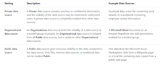
- Option A is incorrect. Private is a valid privacy level in Power BI Desktop.
- Option B is incorrect. Public is a valid privacy level in Power BI Desktop.
- Option C is incorrect. Organizational is a valid privacy level in Power BI Desktop.
- Option D is correct. Confidential is not a valid privacy level in Power BI Desktop.
Prepare the data
Q 22. For the query opened in Power Query Editor, you are interested in finding out the percentage of empty cells or values in each column as soon as possible. Which of the following data Preview Options would you select?
A. Column profile
B. Show Whitespaces
C. Column quality
D. Column distribution
Correct Answer: C
In Power Query Editor, Column Quality, Column distribution, and Column Profile are data profiling functionalities under the View tab in Data Preview Section. These functionalities help in understanding the data anomalies and statistics. Out of these three functionalities, Column quality is the one that can be used to show the percentages of data that is in error, empty and valid.
- Option A is incorrect. The Column profile provides a deeper look into the statistics within the column. This column can be used to provide many different values like the count of rows but it does not help in identifying the percentage of empty cells in the column.
- Option B is incorrect. Using Column Quality, not Show Whitespaces, is the correct option.
- Option C is correct. Column quality is the data preview option that is used to show the percentages of data that is in error, empty and valid.
- Option D is incorrect. Column distribution displays the data distribution within the column and the counts of unique and distinct values. It is not the right choice for the target goal.
Q 23. There is an Azure SQL database having the records for sales transactions. The database is updated on a frequent basis. You need to create reports from the sales data to identify fake transactions. The data needs to be visible within 5 minutes of an update.
How can the data connection be configured to achieve the target?
A. By adding a SQL statement
B. By setting the data connectivity mode to DirectQuery
C. By setting the Command timeout in minutes setting
D. By setting the data connectivity mode to Import
E. By adding a PL/SQL statement
Correct Answer: B
While connecting to a data source in Power BI Desktop, it is always possible to import a copy of the data in Power BI Desktop. Some data sources have the option of connecting directly to the data source using DirectQuery. With the DirectQuery option, no data is imported or copied to Power BI Desktop. For relational sources, the chosen columns and tables appear in the Fields list. In multi-dimensional sources such as SAP Business Warehouse, the dimensions and measures for the chosen cube appear in the Fields list. As you interact with the visualization, Power BI queries the underlying data source and you always view the current data.
- Option A is incorrect. Adding a SQL statement is not the correct configuration for the data connection.
- Option B is correct. The data connectivity mode should be set to DirectQuery.
- Option C is incorrect. To set the Command timeout in minutes setting is not the correct option.
- Option D is incorrect. Setting the data connectivity mode to Import is not the right option. In Import mode, the selected columns and tables are imported into Power BI Desktop. As you build or interact with any visualization, then the Power BI Desktop utilizes the imported data. To view the data updates since the most recent refresh or initial import, you need to refresh the data that will import the full dataset again.
- Option E is incorrect. Adding a PL/SQL statement is not the correct configuration for the data connection.
Q 24. Which of the following is a potential way to improve the performance while getting the data in Power BI?
A. Combining the date and time columns in a single column
B. Pulling the data only into Power BI Service, nor Power BI Desktop
C. Performing some calculations in the original data source
D. Using SELECT SQL statement in SQL queries while pulling the data from a relational database
Correct Answer: C
Power Query and Power Query Editor are designed to allow you to process the data, but the processing power needed to do this may decrease the performance in other areas of your reports. Therefore, it is always a good practice to process as much as possible data in the original data source.
- Option A is incorrect. Combining the date and column in a single column is not the right option as Separating the columns date and time will enhance the compression and therefore the performance.
- Option B is incorrect. Pulling the data only into the Power BI Service is not the right option as there is no performance difference between Power BI service and Power BI Desktop.
- Option C is correct. It is always a good practice to process as much as possible data in the original data source to improve the performance.
- Option D is incorrect. Using a SELECT SQL statement in SQL queries while pulling the data from a relational database might decrease the performance as in this way, you are likely to get more rows and columns than needed.
Q 25. Suppose you have developed a query named consumers in Power BI Desktop to append the rows from 3 external tables with consumer data into a single table consumer.
Now you want to ensure that each row in the consumer table has a unique ID value. Which of the following is the best way to add a new fabricated ID column to the consumer table?
A. Changing the data model by extending the consumers table with an Index column
B. Changing the data model by extending consumer table with a Counter column
C. Modifying the consumers’ query by adding an Index column
D. Modifying the consumers’ query by adding a Counter column
Correct Answer: C
Query editor has an option Index Column to add an indexed column starting from 1,0 or any custom number. “Insert Index Column” is present in the “Add Column” tab that allows the creation of a new index column starting from 0, 1, or any custom number. Users can customize the starting value and row increment for the index.
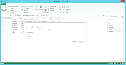
- Option A is incorrect. Modifying the consumers query by adding an Index column is the best way to add a new ID column to the consumer table.
- Option B is incorrect. Modifying the consumers query by adding an Index column is the best way to add a new ID column to the consumer table.
- Option C is correct. Modifying the consumers’ query by adding an Index column is the best way to add a new ID column to the consumer table.
- Option D is incorrect. Modifying the consumers’ query by adding an Index column is the best way to add a new ID column to the consumer table.
Bottom line
We hope these questions offer a glimpse into how the real exam would look like. When are you planning to write the DA-100 Exam? If you need to practice more, check our free practice exam for DA-100.
Reference Links:
- https://docs.microsoft.com/en-us/learn/certifications/exams/da-100
- https://docs.microsoft.com/en-us/dax/calculate-function-dax
- https://docs.microsoft.com/en-us/dax/crossfilter-function
- About the Author
- More from Author

Power BI Exam DA-100
This exam retired (Knowledge has no expiry date). Please check the new version PL-300
Data Analysts enable businesses to maximize the value of their data assets by using Power BI. As a subject matter expert, data analysts are responsible for designing and building scalable data models, cleaning and transforming data, and enabling advanced analytic capabilities that provide meaningful business value through easy-to-comprehend data visualizations. Data analysts also collaborate with key stakeholders across verticals to deliver relevant insights based on identified business requirements. The Data Analyst should have a fundamental understanding of data repositories and data processing both on-premises and in the cloud.
Exam
- Exam DA-100: Analyzing Data with Microsoft Power BI — Microsoft Certification can take you from the start of your career to its pinnacle. Certification can increase your visibility, differentiate you from your peers, and validate your knowledge and skills.
- About Microsoft Certification exams
Skills measured (November 23, 2021)
Prepare the data (20-25%)
Get data from different data sources
- Identify and connect to a data source
- Connect to data sources in Power BI Desktop
- SharePoint Folder
- Change data source settings
- Manage data sources
- Select a shared dataset or create a local dataset
- Connect to datasets in the Power BI service from Power BI Desktop
- Select a storage mode
- Choose an appropriate query type
- Perform common query tasks in Power BI Desktop
- Identify query performance issues
- Troubleshoot report performance in Power BI
- Use Microsoft Dataverse — Create a Power BI report using data from Dataverse
- Common Data Service has been renamed to Microsoft Dataverse
- Use parameters
- Use or create a PBIDS file
- Using PBIDS files to get data
- Use or create a data flow
- Connect to a dataset using the XMLA endpoint
- Dataset connectivity with the XMLA endpoint
Profile the data
- Identify data anomalies
- Column profile
- Examine data structures
- Data types in Power Query
- Column distribution
- Interrogate column properties
- Column quality
- Interrogate data statistics
- Column profile
- Create a Profiling Report in Power BI: Give the End User Information about the Data — radacad.com
Clean, transform, and load the data
- Resolve inconsistencies, unexpected or null values, and data quality issues
- Profile data in Power BI
- Apply user-friendly value replacements
- Simplify the data structure
- Identify and create appropriate keys for joins
- Seven Types of Table Joins — powerbi-pro.com
- Evaluate and transform column data types
- Data types in Power BI Desktop
- Evaluate and change column data types
- Apply data shape transformations to table structures
- Combine multiple tables into a single table
- Shape and combine data in Power BI Desktop (Tutorial)
- Combine queries
- Combine queries — Tutorial: Shape and combine data in Power BI Desktop
- Apply user-friendly naming conventions to columns and queries
- Leverage Advanced Editor to modify Power Query M code
- Configure data loading
- Resolve data import errors
- Viewing Error Messages For All Rows In Power Query — Chris Webb’s BI Blog
Model the data (25-30%)
Design a data model
- Define the tables
- Configure table and column properties
- Define quick measures
- Use quick measures for common calculations
- Flatten out a parent-child hierarchy
- Define role-playing dimensions
- Understand star schema and the importance for Power BI
- Define a relationship’s cardinality and cross-filter direction
- Model relationships in Power BI Desktop
- Design the data model to meet performance requirements
- Best practice rules to improve your model’s performance
- Resolve many-to-many relationships
- Create a common date table
- Create date tables in Power BI Desktop
- Define the appropriate level of data granularity
- Apply or change sensitivity labels
- Enable sensitivity labels in Power BI
Develop a data model
- Apply cross-filter direction and security filtering
- Cross filter direction
- Create calculated tables
- Create calculated tables in Power BI Desktop
- Create hierarchies
- Create calculated columns
- Create calculated columns in Power BI Desktop
- Implement row-level security roles
- Row-level security (RLS) with Power BI
- Implement object-level security
- Set up the Q&A feature
Create measures by using DAX
- Use DAX to build complex measures
- Data Analysis Expressions (DAX) Reference
- Use CALCULATE to manipulate filters
- CALCULATE
- How CALCULATE works in DAX — sqlbi.com
- CALCULATE — dax.guide
- Implement Time Intelligence using DAX
- DATEADD — dax.guide
- DATEQTD — dax.guide
- LASTDATE — dax.guide
- SAMEPERIODLASTYEAR — dax.guide
- Replace numeric columns with measures
- Calculated Columns and Measures in DAX — sqlbi.com
- Use basic statistical functions to enhance data
- MEDIAN — dax.guide
- RANKX — dax.guide
- TOPN — dax.guide
- Create semi-additive measures
- Semi-Additive Measures in DAX — sqlbi.com
Optimize model performance
- Remove unnecessary rows and columns
- Choose or remove columns
- Identify poorly performing measures, relationships, and visuals
- Use Performance Analyzer to examine report element performance
- Improve cardinality levels by changing data types
- Data types in Power Query
- Improve cardinality levels through summarization
- Create and manage aggregations
- Grouping or summarizing rows
- Use Query Diagnostics
Visualize the data (20-25%)
Create Report
- Add visualization items to reports
- Choose an appropriate visualization type
- Format and configure visualizations
- Import a custom visual
- Configure conditional formatting
- Configure small multiples
- Apply slicing and filtering
- How visuals cross-filter each other in a Power BI report * Add an R or Python visual
- Add an R or Python visual
- Add a Smart Narrative visual
- Configure the report page
- Design and configure for accessibility
- Design Power BI reports for accessibility
- Configure automatic page refresh
- Create a paginated report
- What are paginated reports in Power BI Premium?
- Create a PivotTable from a Power BI dataset in Excel
Create dashboards
- Set mobile view
- Optimize Power BI reports for the mobile app
- Manage tiles on a dashboard
- Intro to dashboard tiles for Power BI designers
- Pin a tile to a Power BI dashboard from a report
- Pin a tile from one dashboard to another dashboard
- Add images, videos, and more to your dashboard
- Configure data alerts
- Data alerts in the Power BI service
- Use the Q&A feature
- Tips for asking questions in Power BI Q&A
- Add a dashboard theme
- Use dashboard themes in the Power BI service
- Pin a live report page to a dashboard
- Pin an entire report page, as a live tile, to a Power BI dashboard
Enrich reports for usability
- Configure bookmarks
- Create custom tooltips
- Edit and configure interactions between visuals
- Configure navigation for a report
- Apply sorting
- Configure Sync Slicers
- Use the selection pane
- Use drillthrough and cross filter
- Drilldown into data using interactive visuals
- Export report data
- Design reports for mobile devices
Analyze the data (10-15%)
Enhance reports to expose insights
- Apply conditional formatting
- Apply slicers and filters
- Perform top N analysis
- How to Create Power BI TOP N Report (Variable TOP N Filter) — Avi Singh
- Explore statistical summary
- Explore statistical summary
- Create a Profiling Report in Power BI — radacad.com
- Use the Q&A visual
- Create a Q&A visual in Power BI
- Add a Quick Insights result to a report
- Generate data insights on your dataset automatically with Power BI
- Create reference lines by using Analytics pane
- Use the Analytics pane in Power BI Desktop
- Use the Play Axis feature of a visualization
- Scatter charts, bubble charts, and dot plot charts in Power BI
- Personalize visuals
- Let users personalize visuals in a report
Perform advanced analysis
- Identify outliers
- Detecting & Showcasing Outlier Results In Power BI — enterprisedna.co
- Conduct Time Series analysis
- How Forecasting in Power BI Works — spreadsheeto.com
- Use anomaly detection
- Anomaly detection
- Use groupings and binnings
- Use grouping and binning in Power BI Desktop
- Use the Key Influencers to explore dimensional variances
- Create key influencers visualizations
- Use the decomposition tree visual to break down a measure
- Create and view decomposition tree visuals in Power BI
- Apply AI Insights
- Use AI Insights in Power BI Desktop
Deploy and maintain deliverables (10-15%)
Manage datasets
- Configure a dataset scheduled refresh
- Data refresh in Power BI
- Configure row-level security group membership
- Row-level security (RLS) with Power BI
- Provide access to datasets
- Configure incremental refresh settings
- Incremental refresh for datasets
- Promote or certify Power BI datasets
- Endorse your content
- Identify downstream dataset dependencies
- Identifying shared datasets
- Configure large dataset format
Create and manage workspaces
- Create and configure a workspace
- Create the new workspaces in Power BI
- Recommend a development lifecycle strategy
- Assign workspace roles
- Roles in the new workspaces
- Organize work in the new workspaces in Power BI
- Configure and update a workspace app
- Publish an app in Power BI
- Publish, import, or update assets in a workspace
- Apply sensitivity labels to workspace content
- How to apply sensitivity labels in Power BI
- Use deployment pipelines
- Get started with deployment pipelines
- Configure subscriptions
- Subscribe others to your reports and dashboards in the Power BI service
- Promote or certify Power BI content
- Endorsement — Promoting and certifying Power BI content
Kahoot
- Power BI Quiz with Chris Finlan — March 2021
- Power BI Quiz with Lukasz Pawlowski — February 2021
- Power BI Quiz with Alberto Ferrari — February 2021
- Power BI Quiz with Daniel Otykier — January 2021
- Power BI Quiz with Darren Gosbell — January 2021
- Power BI Quiz with Matthew Roche — July 2020
- Power BI Quiz with Rishi Sapra — July 2020
- Power BI Quiz with Will Thompson — June 2020
- Power BI Quiz with Adam Saxton — May 2020
- Power BI Quiz with Marco Russo — May 2020
Microsoft Learn
- Get started with Microsoft data analytics
- Prepare data for analysis
- Model data in Power BI
- Visualize data in Power BI
- Data analysis in Power BI
- Manage workspaces and datasets in Power BI
- Empower modern analytics and business intelligence data cultures with Excel, Power BI, MS Teams, and SharePoint


Внимание!
ЦТ Pearson VUE и Certiport приостановили работу на территории Российской Федерации.
В связи с изменением курса рубля по отношению к иностранной валюте актуальную стоимость экзаменов уточняйте у наших операторов по контактным телефонам или электронной почте учебного центра Softline.
Data Analysts помогают компаниям максимизировать стоимость своих активов данных с помощью Microsoft Power BI. Являясь экспертом в данной области, Data Analyst отвечает за проектирование и построение масштабируемых моделей данных, очистку и преобразование данных, а также за предоставление расширенных аналитических возможностей, которые обеспечивают значимую ценность для бизнеса с помощью простой для понимания визуализации данных. Data Analyst также сотрудничает с ключевыми заинтересованными сторонами в отраслевой вертикали для предоставления соответствующей информации на основе определенных бизнес-требований.
Data Analyst должен иметь общее представление о хранилищах данных и их обработке как в производственных условиях, так и в облаке.
- Отзывы
Ищете экзамены или тестирование Analyzing Data with Microsoft Power BI по технологиям Microsoft? Учебный центр Softline – проверенный бизнес-партнер. Каталог экзаменов УЦ Softline – самый полный и содержит только востребованные специалистами материалы.
Вы можете пройти сертификацию Analyzing Data with Microsoft Power BI в в Учебном центре Softline. Мы будем рады оказать всестороннюю поддержку! В УЦ Софтлайн есть онлайн-экзамены Microsoft от Microsoft, а также очные занятия.
Как итог сдачи экзамена Analyzing Data with Microsoft Power BI вы получите соответствующий документ от компании-производителя, подтверждающий ваш профессиональный уровень знаний.
Каков план действий? Укажите соответствующий экзамен, положите его в корзину, оплатите онлайн и будьте уверены – новые знания обязательно принесут большие перспективы.